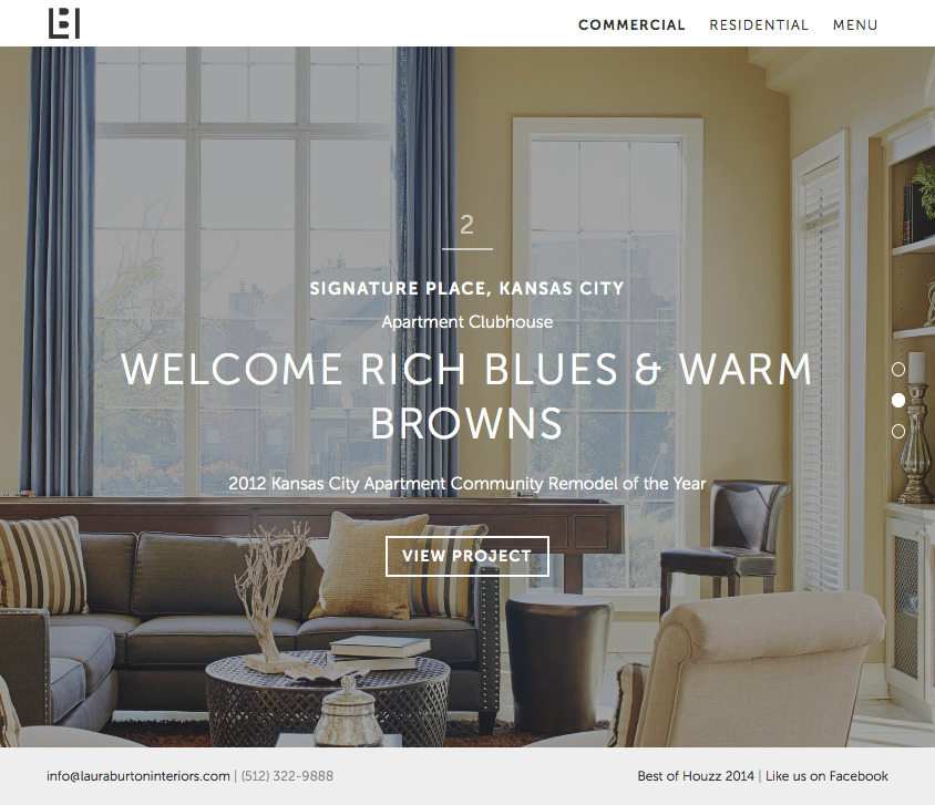
Laura Burton was looking for a website that distinguished her and her award-winning work from other designers in the Austin area. Immersing the visitor in her beautiful designs was the most important task, so everything became secondary to the photography. Fullscreen images also translated well across devices and allows the visitor to use gestures to navigate the projects under each category. The second goal of the website was to convey a level of professionalism that attracted more commercial clients, rather than residential clients who may want to take a more DIY approach rather than deferring to Laura's expertise.


At the bottom of each project page, a photo and button to the next project in that category is displayed. This is to keep the visitor exploring.
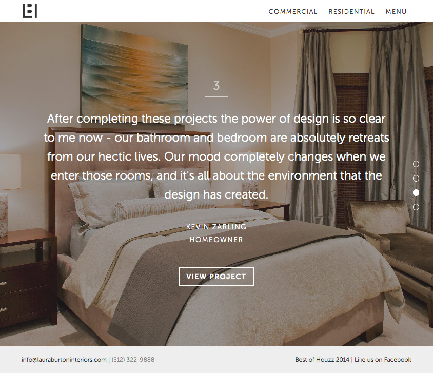
Using the same format as the project category pages, each testimonial is displayed over a fullscreen photo from the project and includes a link to the project page. The group of testimonials can be navigated by gesture or scrolling.

